Logos and Apparel Design
Objective + Results
Oftentimes clients approach the studio to design logos for brands, programs, companies, athletes or products, and the marks often end up on a shirt. Below is a selection of logos and identities designed by the studio over the years, ranging from sports to corporate to small business branding, followed by apparel work.
credits
CLIENTS
Various, including Spalding University Athletics and SkratchTV
CREATIVE DIRECTOR + DESIGNER
T. Adam Martin, T/A Martin Studio
Various, including Spalding University Athletics and SkratchTV
CREATIVE DIRECTOR + DESIGNER
T. Adam Martin, T/A Martin Studio
Services Provided
›› Identity and Logo Design
›› Apparel Design
›› Illustration
›› Apparel Design
›› Illustration
Identity design
Logos



Logo design
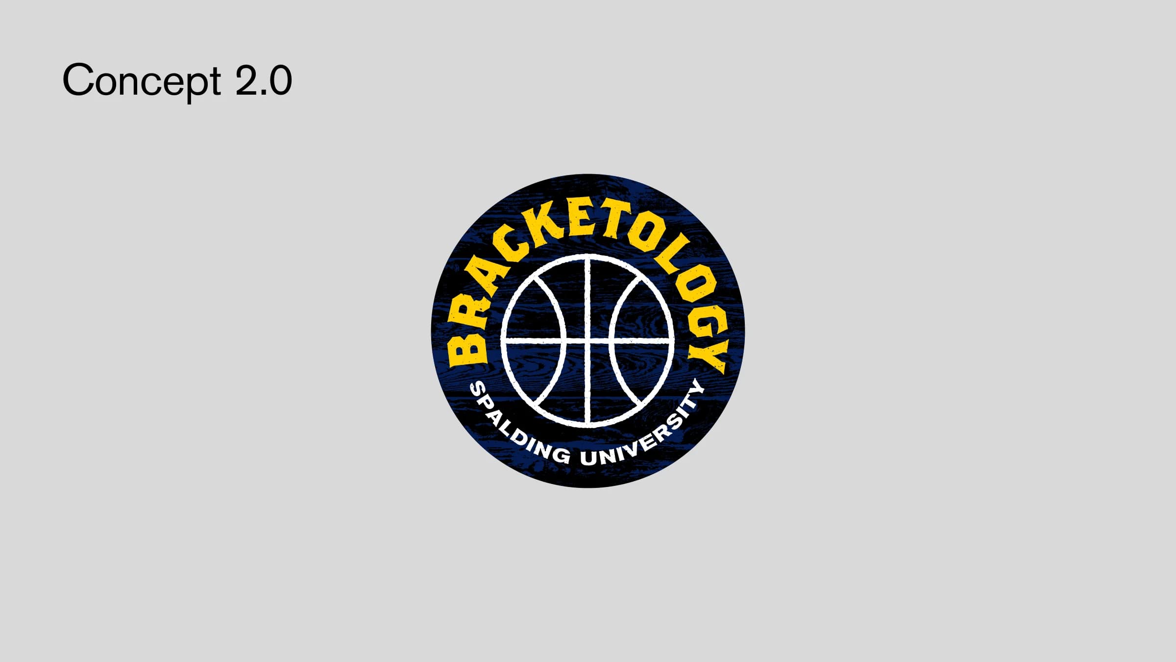
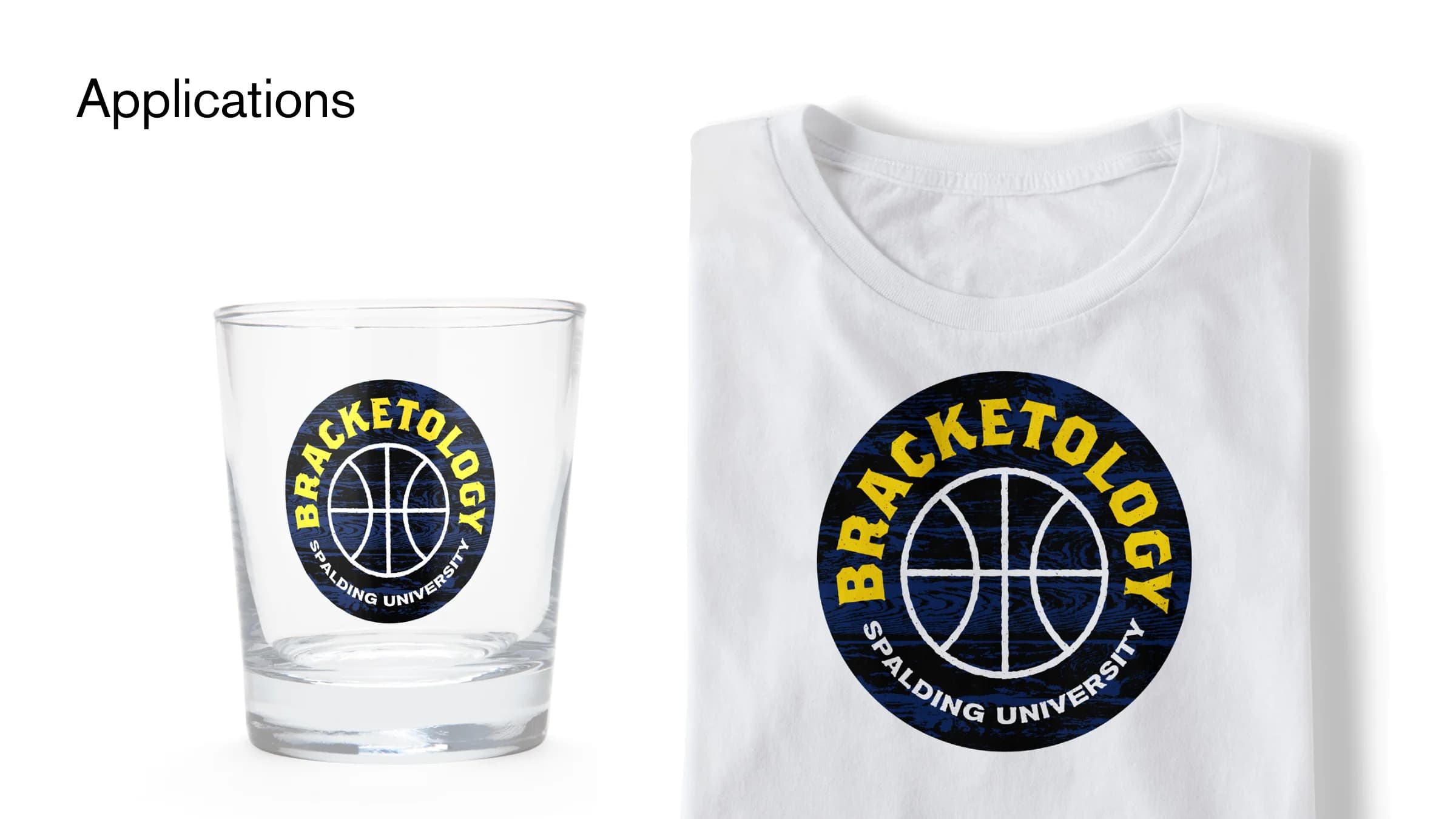
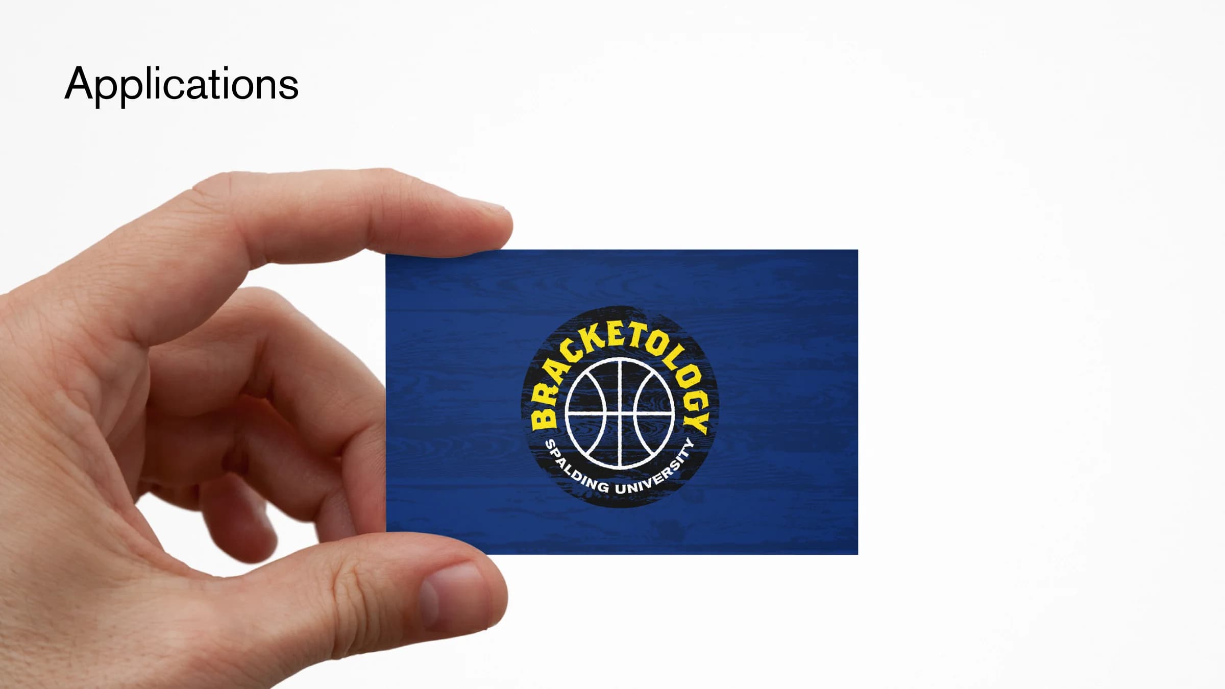
Bracketology for Spalding University
Bracketology is Spalding University’s bourbon-inspired basketball fundraiser in Louisville. The chosen mark sets a display serif from the spirits world in a circle around a simple basketball, over a texture of barrel-wood planks.
Apparel · graphic design and illustration
SkratchTV Tees
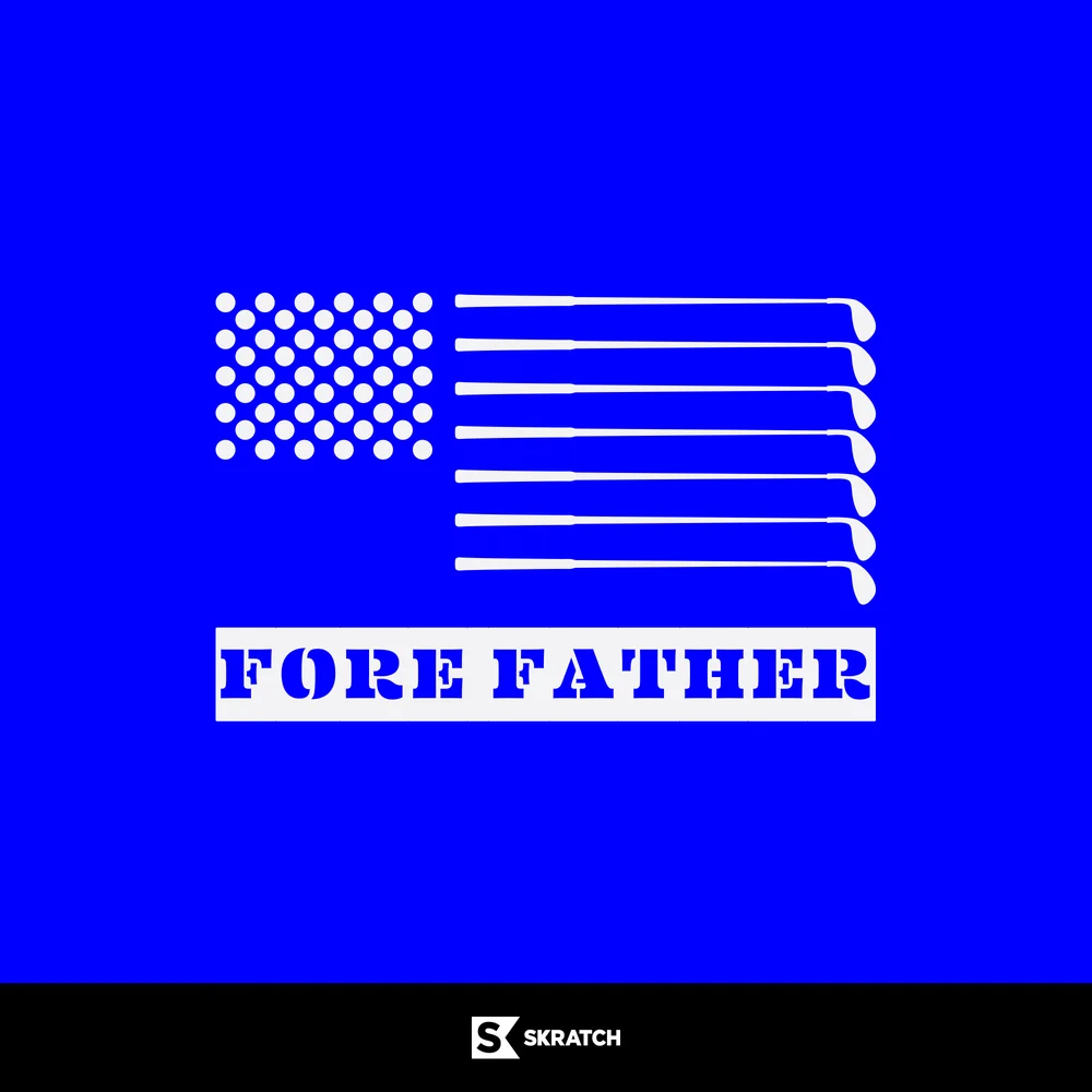
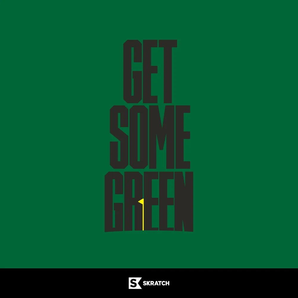
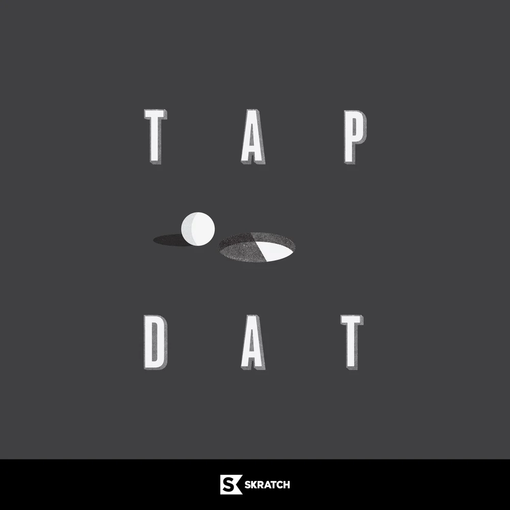
SkratchTV launched as golf’s first internet video network, a joint venture between the PGA TOUR and Bedrocket built for a golf-hungry community of creators, pro athletes and fans. Its pitch was short attention span golf in a voice that echoes its users: whip-smart, funny, and a little bit brash. T/A Martin Studio designed a run of tee graphics in that same voice.
Each design bends a straight piece of golf language slightly: Golf Untucked, Fore Father, Get Some Green, Golf Less Seriously and Tap Dat. All five run off the same setup, a heavy display cut over a single flat color with the Skratch mark small underneath, so the line reads as a set.
Each design bends a straight piece of golf language slightly: Golf Untucked, Fore Father, Get Some Green, Golf Less Seriously and Tap Dat. All five run off the same setup, a heavy display cut over a single flat color with the Skratch mark small underneath, so the line reads as a set.