
NIL Athlete Branding for Wan’Dale Robinson
Objective + Results
The Virtus Brand guides current and former student-athletes through the name, image, and likeness (NIL) process. The NIL agency engaged T/A Martin Studio to create a personal brand identity for then University of Kentucky wide receiver Wan’Dale Robinson.
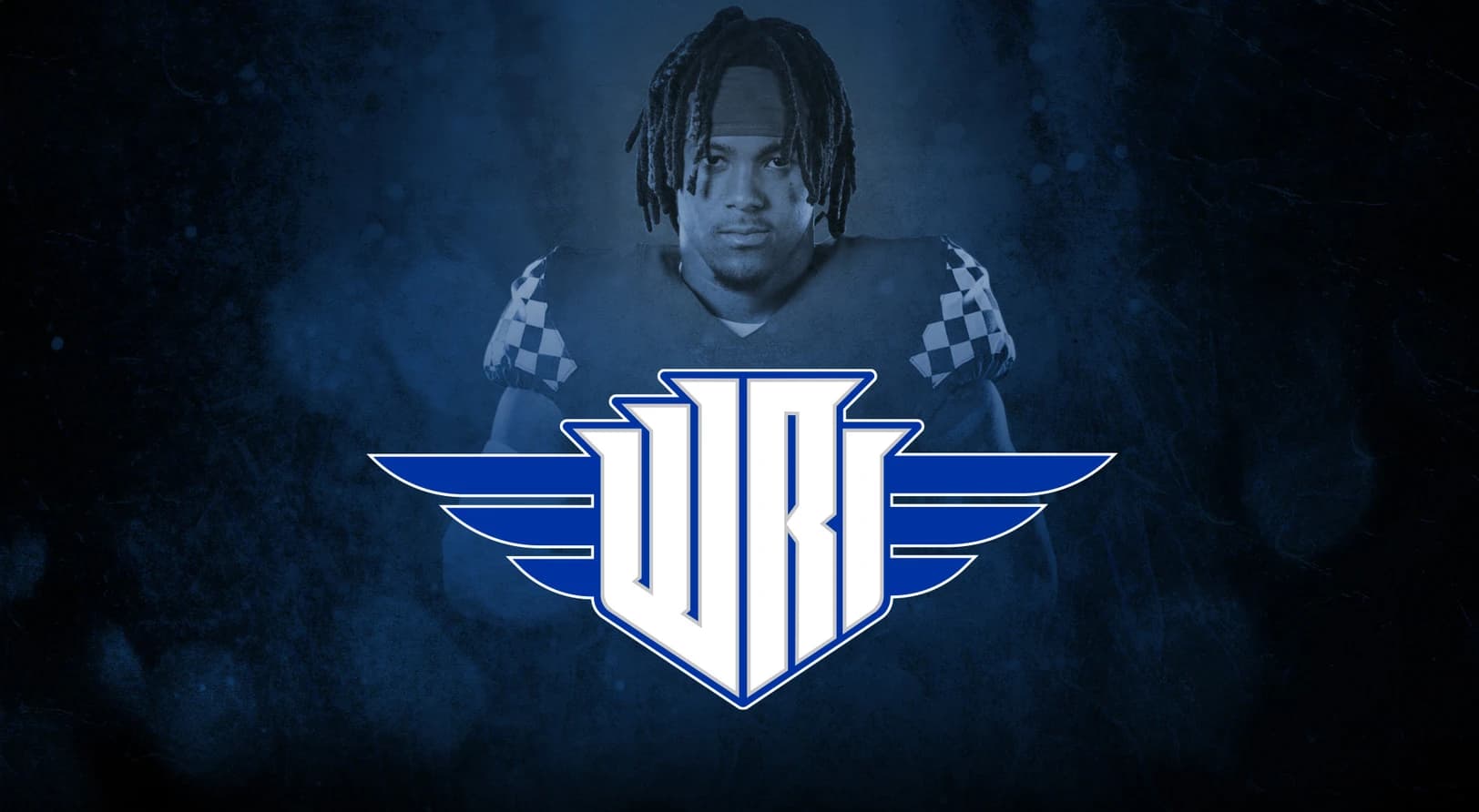
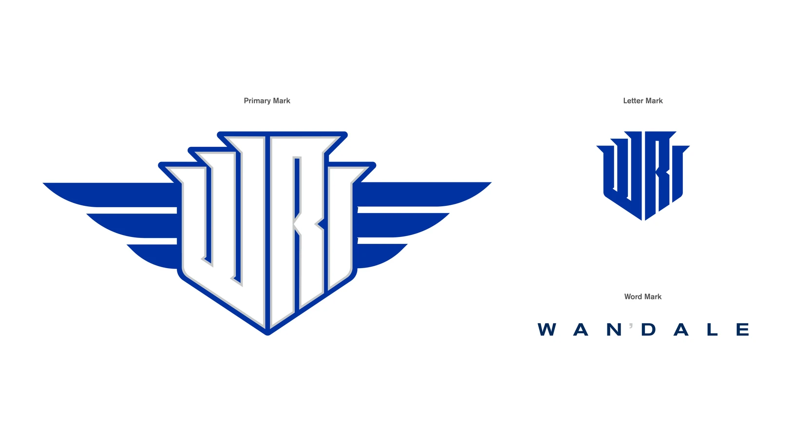
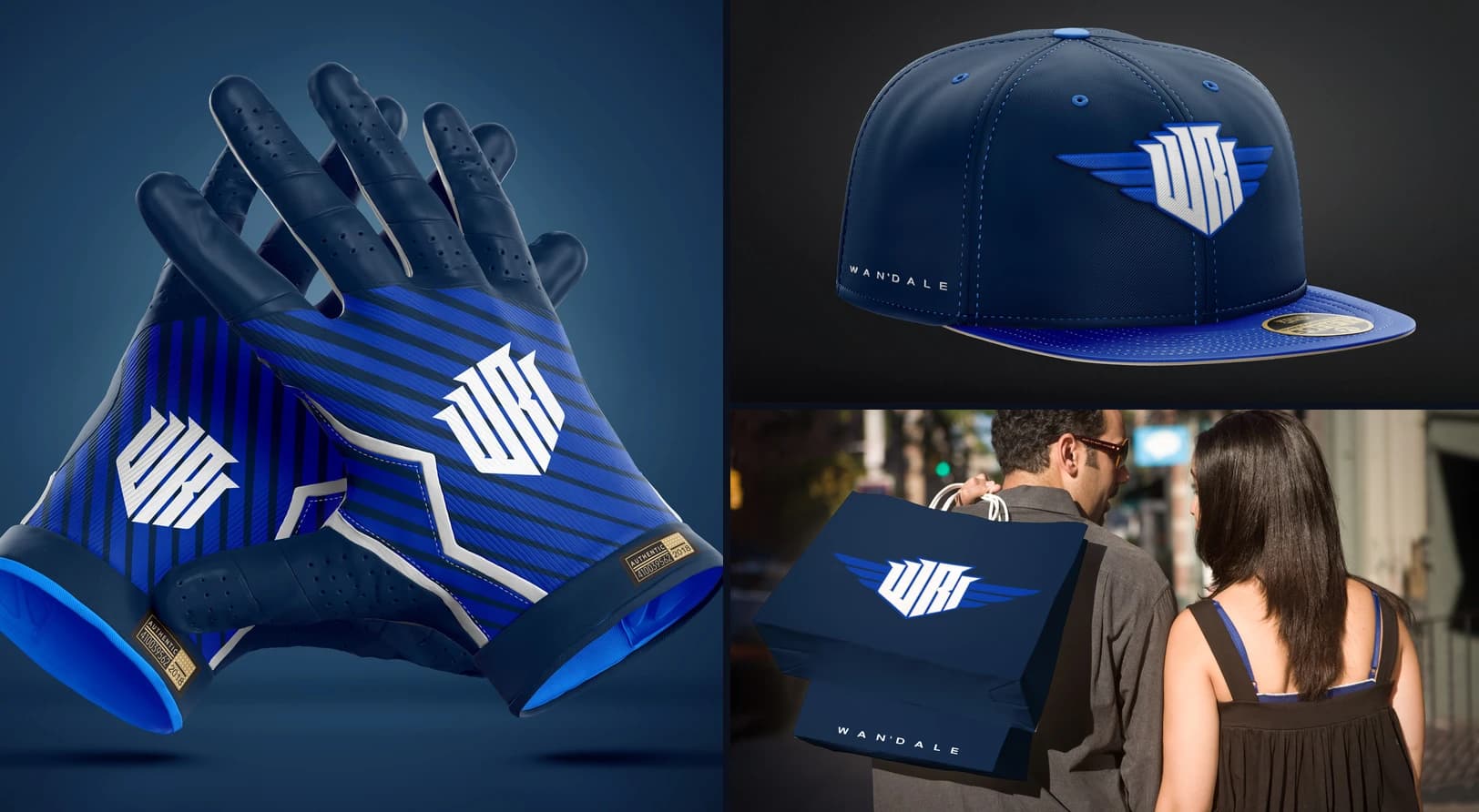
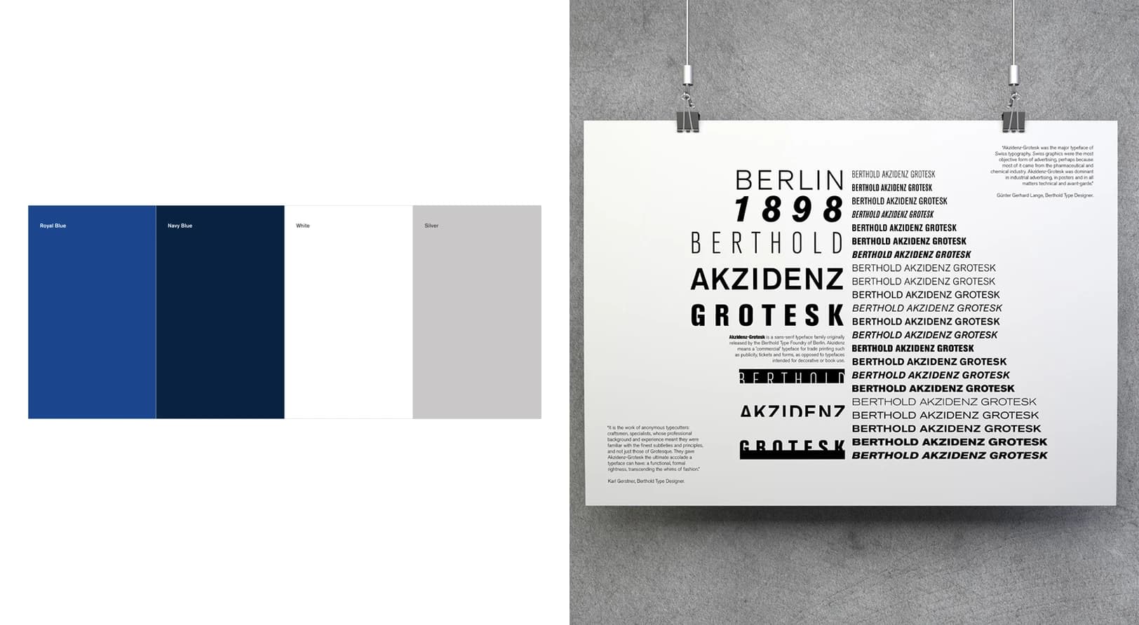
Wan’Dale’s game and style are versatile, so his visual branding needed to be as well. The studio designed a flexible identity system anchored by a sharp-edged, shield-like monogram built from his initials and uniform number, with a set of wings inspired by the wings tattooed on his chest. The monogram works with or without the wings, and the palette draws from University of Kentucky royal blue, navy, white, and silver.
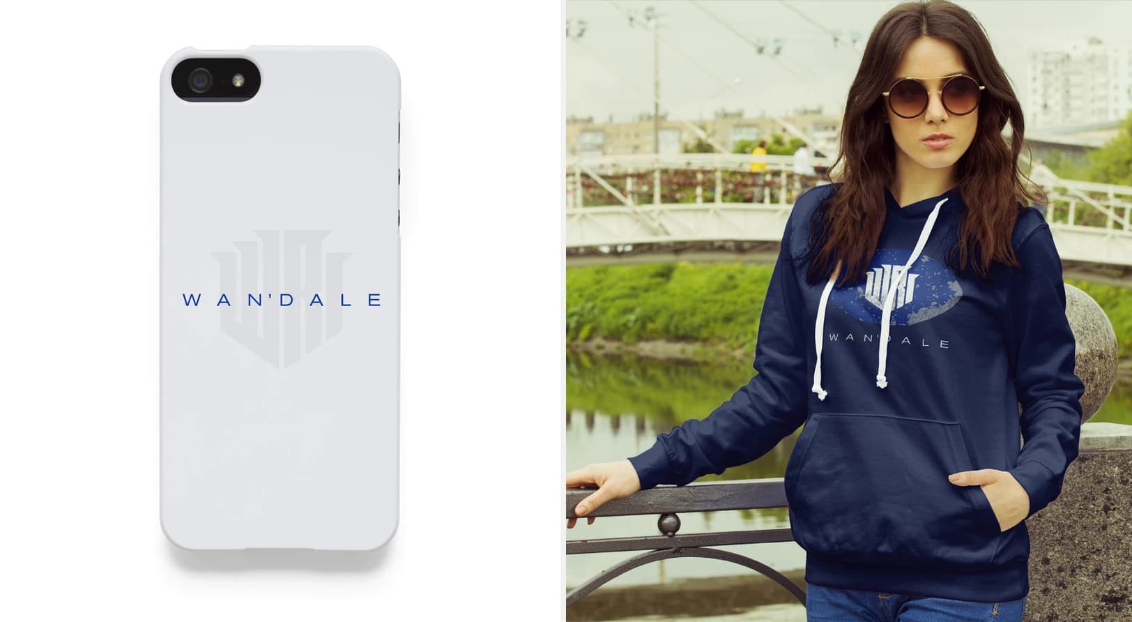
Wan’Dale’s name is unique. Messi. Ronaldo. LeBron. When fans know you by one name, you’ve made it. The studio designed a bespoke wordmark built to make the name Wan’Dale famous, paired with Akzidenz Grotesk, a typeface popularized by Swiss designers for its versatility, a fitting match for a player often called a Swiss Army knife on the field.
Wan’Dale’s game and style are versatile, so his visual branding needed to be as well. The studio designed a flexible identity system anchored by a sharp-edged, shield-like monogram built from his initials and uniform number, with a set of wings inspired by the wings tattooed on his chest. The monogram works with or without the wings, and the palette draws from University of Kentucky royal blue, navy, white, and silver.
Wan’Dale’s name is unique. Messi. Ronaldo. LeBron. When fans know you by one name, you’ve made it. The studio designed a bespoke wordmark built to make the name Wan’Dale famous, paired with Akzidenz Grotesk, a typeface popularized by Swiss designers for its versatility, a fitting match for a player often called a Swiss Army knife on the field.
credits
CLIENT
Wan’Dale Robinson
The Virtus Brand
CREATIVE DIRECTOR + DESIGNER
T. Adam Martin, T/A Martin Studio
Wan’Dale Robinson
The Virtus Brand
CREATIVE DIRECTOR + DESIGNER
T. Adam Martin, T/A Martin Studio
Services Provided
›› Brand Strategy
›› Athlete Branding
›› NIL Branding
›› Identity/Logo Design
›› Bespoke Wordmark
›› Color & Typography
›› Brand Guidelines
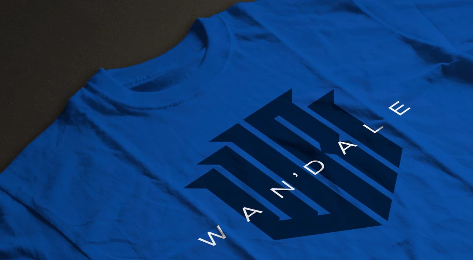
›› Merchandise Mockups
›› Athlete Branding
›› NIL Branding
›› Identity/Logo Design
›› Bespoke Wordmark
›› Color & Typography
›› Brand Guidelines
›› Merchandise Mockups
Athlete Branding
See more of our athlete branding and personal logo design work for pro and college athletes.