
3d Lacrosse Market Brand Identity System
Objective + Results
3d Lacrosse, a fast-growing, Denver-based youth lacrosse company founded by a former Ivy League coach, owns select teams and events in markets across North America. As the company's retained agency partner, T/A Martin Studio was engaged to diagnose and solve a branding problem brought on by rapid growth and a few acquisitions.
Research revealed the brand was becoming diluted. Each local market was setting its own logo in the same free font used for the corporate 3d Lacrosse wordmark, so the wordmark was no longer unique, and anyone, including competitors, could type out their own version. Each market also used its own symbols at different shapes and sizes, which made it impossible to give every team equal visual weight on uniforms, apparel, and social avatars.
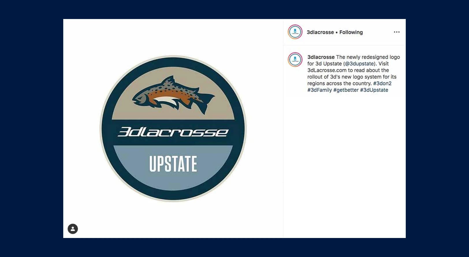
The markets were passionate about keeping their individuality, and the CEO did not want to change the wordmark. So the studio built a strategy and guidelines that isolate the 3d wordmark in every instance of the brand, and designed a logo system within a containing roundel with consistent X and Y-axis weight. A secondary typography system handles market names of any length, while the top half of each roundel allows custom color and illustration.
The system let each market keep its own identity while staying cohesive with its sister markets and giving the 3d Lacrosse wordmark prominence on every team. It positioned the brand to scale into new markets with strict guidelines for building each new logo.
Research revealed the brand was becoming diluted. Each local market was setting its own logo in the same free font used for the corporate 3d Lacrosse wordmark, so the wordmark was no longer unique, and anyone, including competitors, could type out their own version. Each market also used its own symbols at different shapes and sizes, which made it impossible to give every team equal visual weight on uniforms, apparel, and social avatars.
The markets were passionate about keeping their individuality, and the CEO did not want to change the wordmark. So the studio built a strategy and guidelines that isolate the 3d wordmark in every instance of the brand, and designed a logo system within a containing roundel with consistent X and Y-axis weight. A secondary typography system handles market names of any length, while the top half of each roundel allows custom color and illustration.
The system let each market keep its own identity while staying cohesive with its sister markets and giving the 3d Lacrosse wordmark prominence on every team. It positioned the brand to scale into new markets with strict guidelines for building each new logo.
credits
CLIENT
3d Lacrosse
CREATIVE DIRECTOR + ILLUSTRATOR
T. Adam Martin, T/A Martin Studio
CONTRIBUTING ILLUSTRATOR
Adam Eargle
3d Lacrosse
CREATIVE DIRECTOR + ILLUSTRATOR
T. Adam Martin, T/A Martin Studio
CONTRIBUTING ILLUSTRATOR
Adam Eargle
Services Provided
›› Research
›› Brand Strategy
›› Brand Architecture
›› Creative Direction
›› Art Direction
›› Illustration
›› Visual Identity Design
›› Identity System
›› Brand Guidelines
›› Brand Strategy
›› Brand Architecture
›› Creative Direction
›› Art Direction
›› Illustration
›› Visual Identity Design
›› Identity System
›› Brand Guidelines




College Athletics
See more of our college athletics branding and sports design work for athletic departments and conferences.